4 Regression
4.1 Models and regression lines
As we saw yesterday, ANOVAs and the LM are really close to each other. Both can be conceptualized as linear models that do most of their work by fitting a line.
We talked about this briefly yesterday, today we should dive into the theory a little bit more.
As you may remember from school, we can describe a line as follows, where \(b_0\) is the intercept, \(b_1\) the slope, and \(e\) is the error term:
\[y = b_0 + b_1x + e\]
But let us take a step back first. Say this is our data:
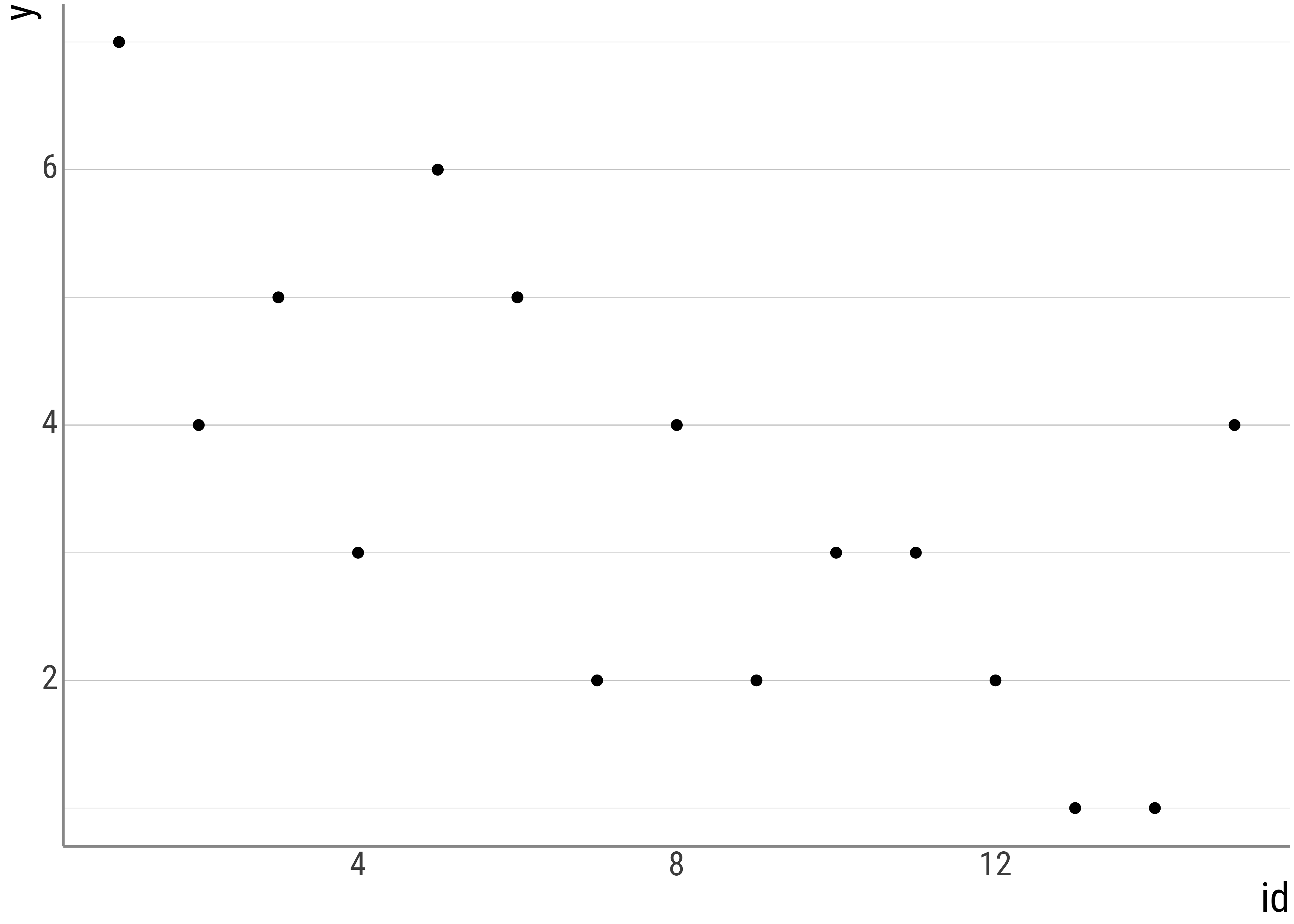
But this is just a representation, not a model.
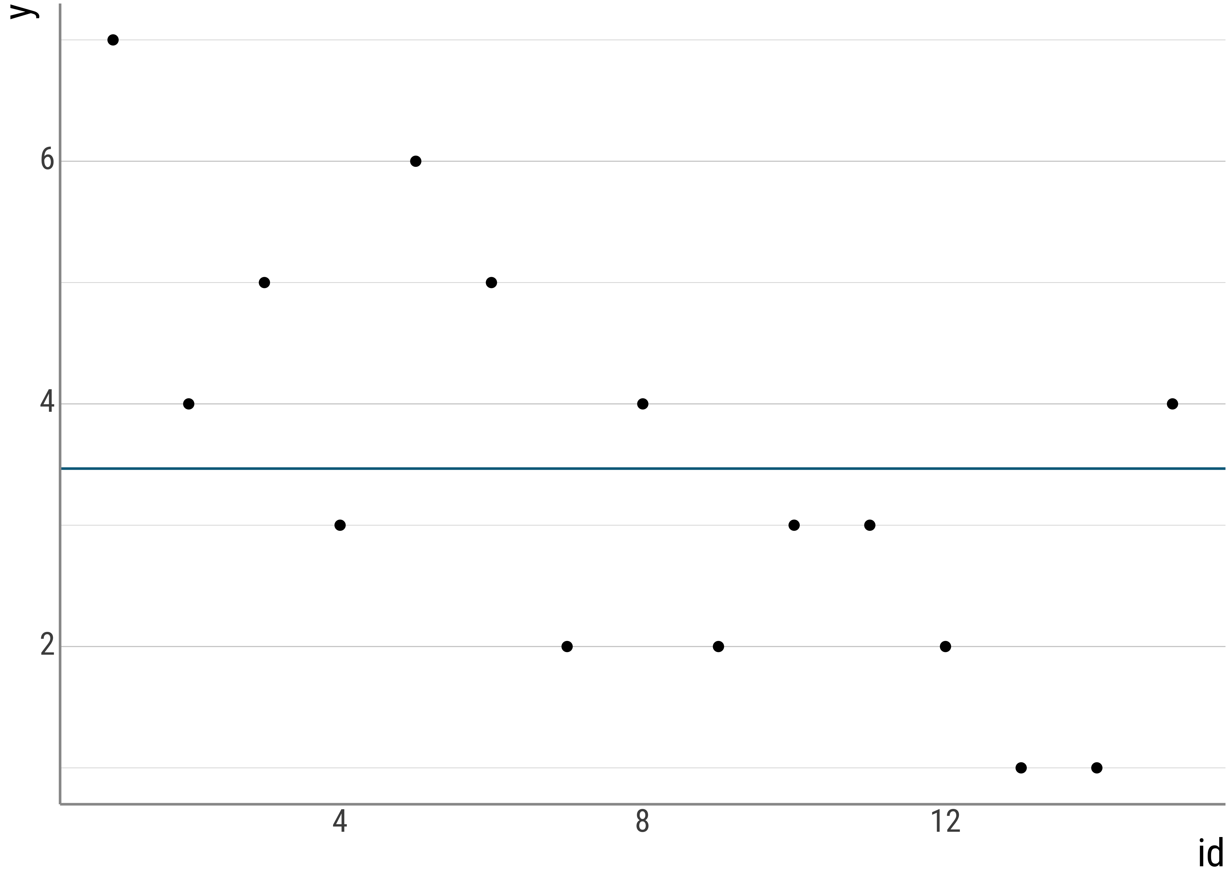
For example, we could have a so-called intercept-only model. In these cases, the intercept is just the grand mean we saw in the ANOVA by hand portion yesterday:
\[y_i = \bar{y} + e_i\]
This model just says that our line maps each individual observation \(y_i\) to the grand mean, \(\bar{y}\) plus some error, where the error is the distance from the observation to the mean:
summary(lm(judgment ~ 1, data = d_psp))##
## Call:
## lm(formula = judgment ~ 1, data = d_psp)
##
## Residuals:
## Min 1Q Median 3Q Max
## -2.64688 -1.64688 0.35312 1.35312 1.35312
##
## Coefficients:
## Estimate Std. Error t value Pr(>|t|)
## (Intercept) 3.646880 0.056258 64.824 < 0.00000000000000022 ***
## ---
## Signif. codes: 0 '***' 0.001 '**' 0.01 '*' 0.05 '.' 0.1 ' ' 1
##
## Residual standard error: 1.442 on 656 degrees of freedomIn a plot, the line looks like this:
But, of course, the mean is not a really interesting model.
In what is to come, we will have a look at more complex models and talk about how to interpret them.
4.2 Varying intercepts, slopes, and errors
Let’s familiarize ourselves with the graphical effects of changing intercepts, slopes, and errors.
As a first step, we manipulate only the intercepts of the lines, while keeping everything else constant. That is, the slope of the line should remain exactly the same.
eq_0 <- function(x) {
  0 + 1 * x
}
eq_1 <- function(x) {
  1 + 1 * x
}
eq_2 <- function(x) {
  2 + 1 * x
}
base_plot <- function(eq) {
  tibble(x = c(-7, 7)) %>%
    ggplot(aes(x = x)) +
    stat_function(fun = eq, color = colors[1]) +
    coord_cartesian(ylim = c(0, 7)) +
    geom_vline(xintercept = 0, color = "grey", lty = "dashed")
}
p_0 <- base_plot(eq_0)
p_1 <- base_plot(eq_1)
p_2 <- base_plot(eq_2)

p_0 / p_1 / p_2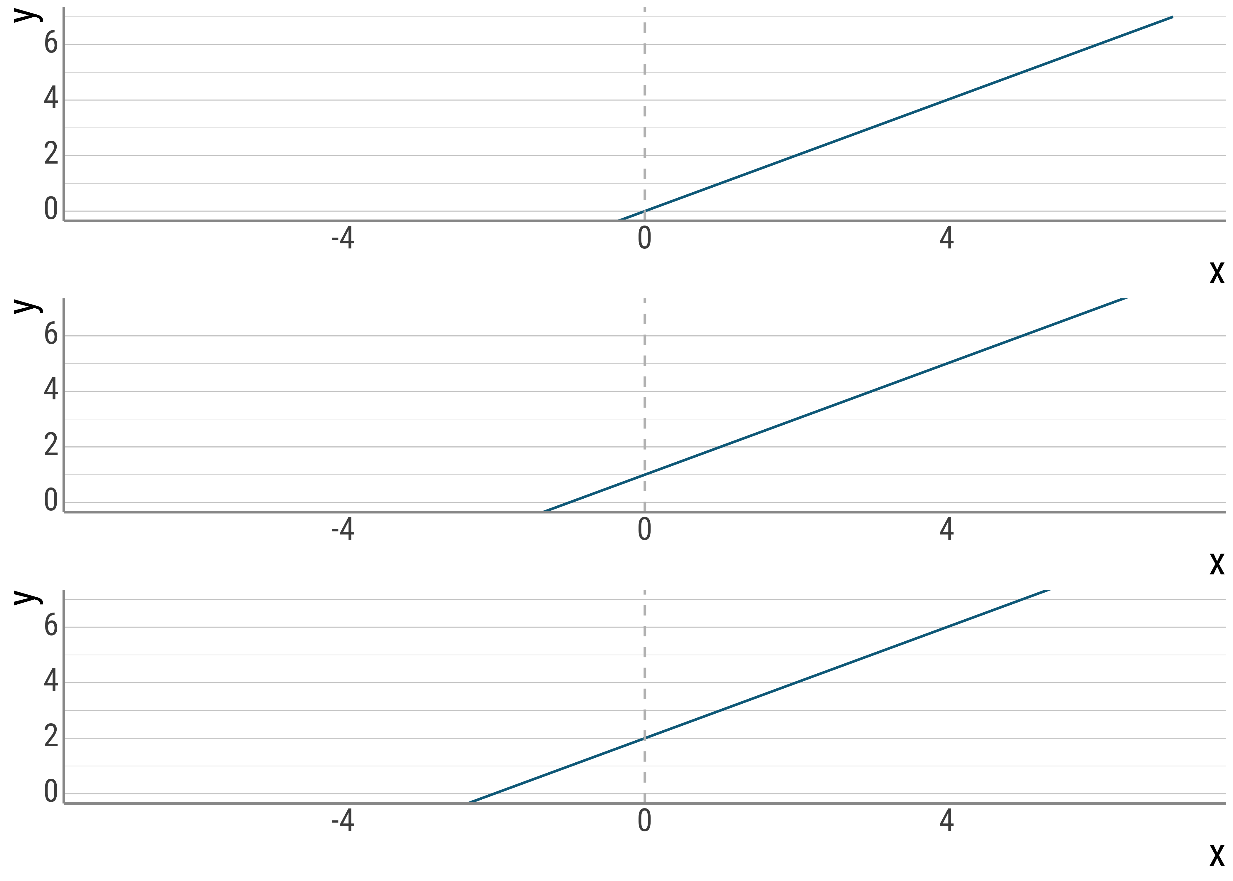
Figure 4.1: Varying slopes.
Below, I keep the intercepts constant (at \(0\)) and vary only the slopes:
eq_0 <- function(x) {
  0 + 0 * x
}
eq_1 <- function(x) {
  0 + 1 * x
}
eq_2 <- function(x) {
  0 + 2 * x
}
base_plot <- function(eq) {
  tibble(x = c(-7, 7)) %>%
    ggplot(aes(x = x)) +
    stat_function(fun = eq, color = colors[1]) +
    coord_cartesian(ylim = c(0, 7)) +
    geom_vline(xintercept = 0, color = "grey", lty = "dashed")
}
p_0 <- base_plot(eq_0)
p_1 <- base_plot(eq_1)
p_2 <- base_plot(eq_2)

p_0 / p_1 / p_2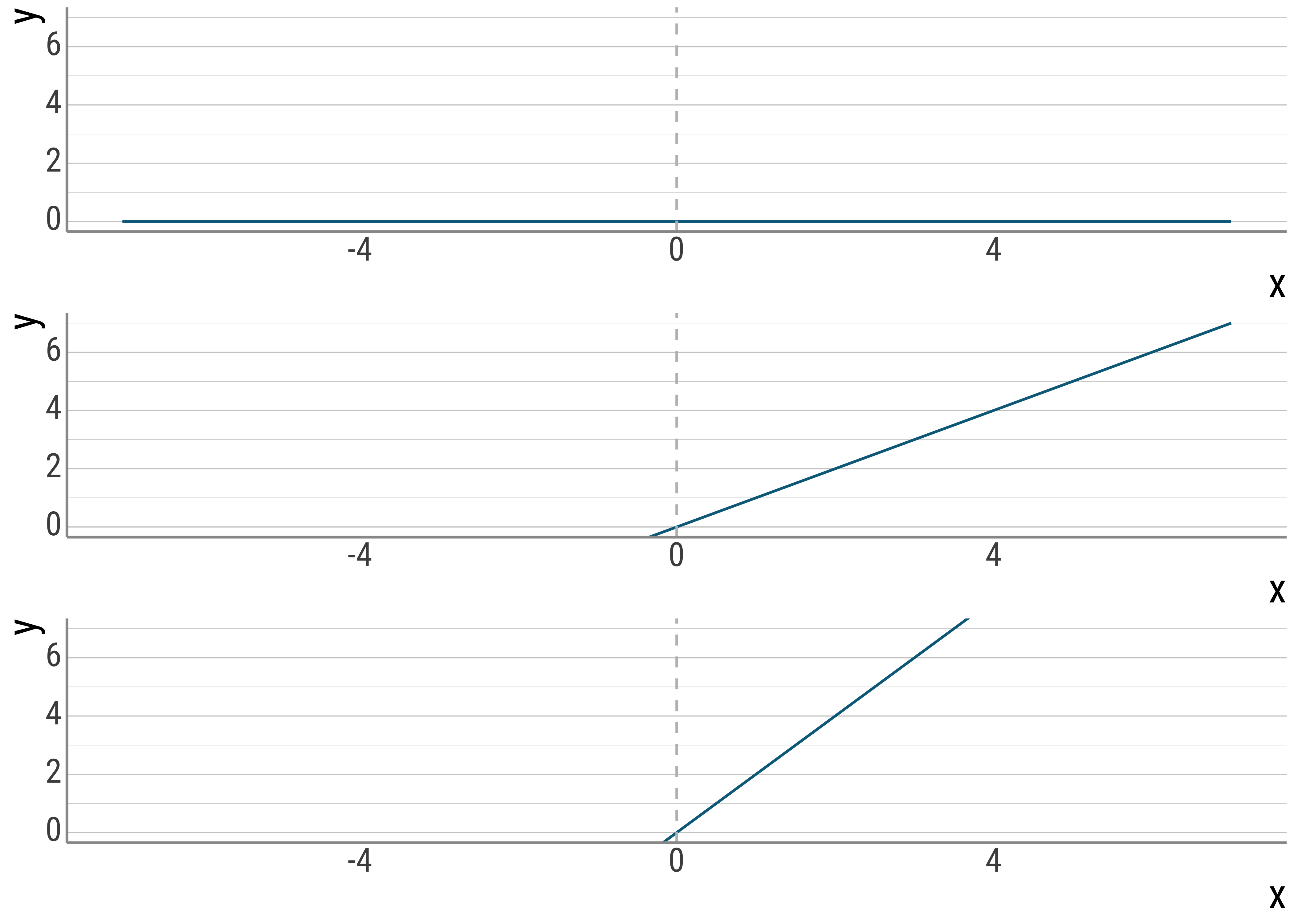
Figure 4.2: Varying slopes.
And here I vary the errors. In the first plot, \(x\) predicts \(y\) perfectly, in the second, there is some noise.
set.seed(1234)
base_plot <- function(error) {
  x <- rnorm(50)
  y <- 5 + 3 * x + error
  tibble(x = x, y = y) %>%
    ggplot(aes(x = x, y = y)) +
    geom_smooth(method = "lm", se = FALSE, color = colors[1]) +
    geom_point(size = 3)
}

p_0 <- base_plot(rep(0, 50))
p_1 <- base_plot(rnorm(50))

p_0 / p_1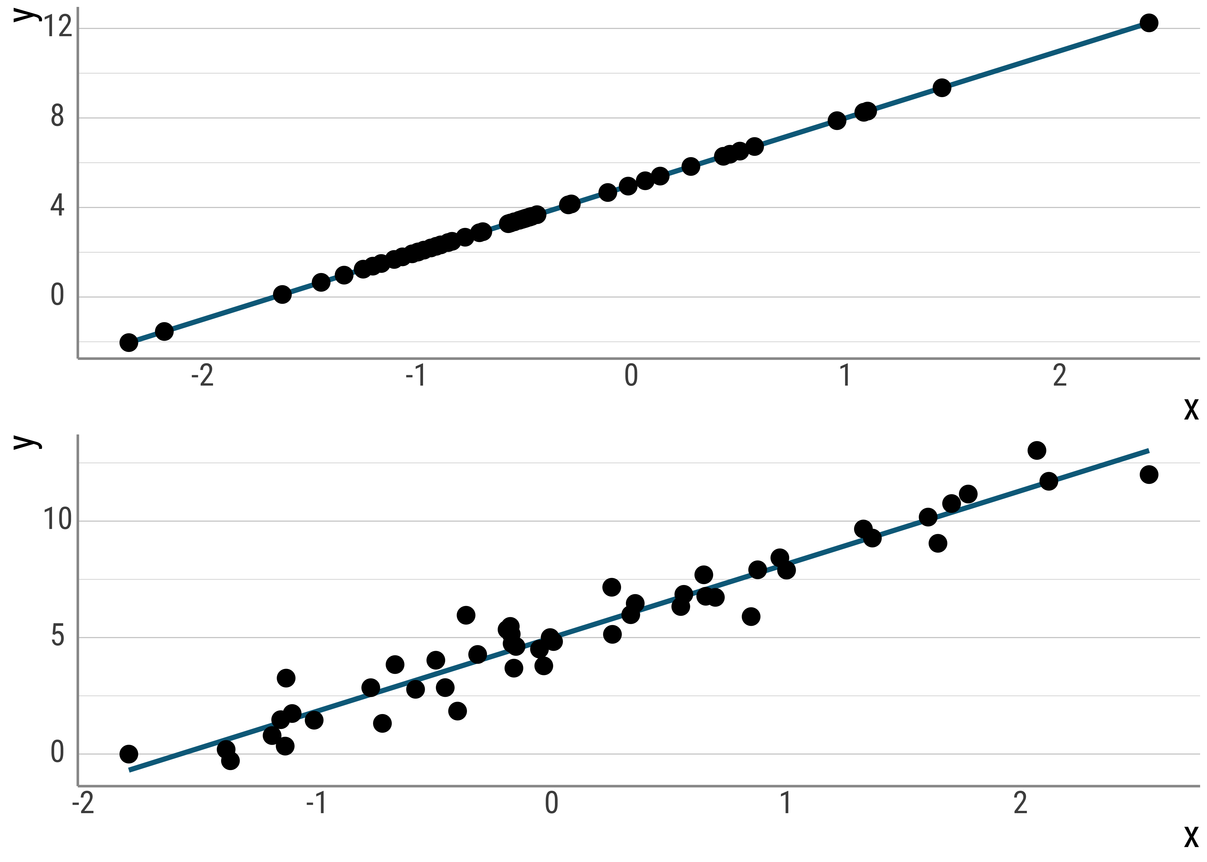
Figure 4.3: Varying error terms.
Note that the errors are also a part of the unsystematic variance we talked about. They represent deviations from our prediction that cannot be explained by our model. These errors, as said before, are also called residuals.
4.3 Regression in R
Here is some data from this paper.
students <- read.csv(here("assets", "data", "student-mat.csv")) %>%
  select(G3, sex, age, studytime)
head(students)
## G3 sex age studytime
## 1 6 F 18 2
## 2 6 F 17 2
## 3 10 F 15 2
## 4 15 F 15 3
## 5 10 F 16 2
## 6 15 M 16 2Let’s again compute a \(t\)-test to see whether there are any differences on the G3 scores by sex:
t.test(G3 ~ sex, data = students, paired = FALSE, var.equal = TRUE) %>%
  tidy()
## # A tibble: 1 × 10
## estimate estimate1 estimate2 statistic p.value parameter conf.low conf.high method alternative
## <dbl> <dbl> <dbl> <dbl> <dbl> <dbl> <dbl> <dbl> <chr> <chr>
## 1 -0.948 9.97 10.9 -2.06 0.0399 393 -1.85 -0.0441 Two Sample t-test two.sidedOnce again, in this simple case, the \(t\)-test is equivalent to the linear regression (called using the lm() function):
m_students <- lm(G3 ~ sex, data = students)
summary(m_students) %>%
  tidy() %>%
  mutate(p.value = scales::pvalue(p.value))
## # A tibble: 2 × 5
## term estimate std.error statistic p.value
## <chr> <dbl> <dbl> <dbl> <chr>
## 1 (Intercept) 9.97 0.316 31.5 <0.001
## 2 sexM 0.948 0.460 2.06 0.040The line intercepts the \(y\) axis at \(\sim9.9\). As you change the \(x\)-axis value by \(1\) (which represents our change from female to male because of the way the predictor was represented), the slope of the line changes by \(\sim 0.94\).
In effect, everything else being equal, male students have higher G3 scores than women.
But let’s also check if we can see the coefficients that the lm() computed in a plot. To generate the line, I use the geom_smooth() (with method = "lm") function:
students %>%
  mutate(sex = if_else(sex == "F", 0, 1)) %>%
  ggplot(aes(x = sex, y = G3)) +
  geom_jitter(alpha = .2) +
  stat_summary(fun = mean, geom = "point", size = 2, color = colors[1]) +
  stat_smooth(method = "lm", geom = "line", color = colors[1], se = FALSE, fullrange = TRUE) +
  scale_y_continuous(breaks = scales::breaks_extended(n = 18)) +
  scale_x_continuous(breaks = c(0, 1))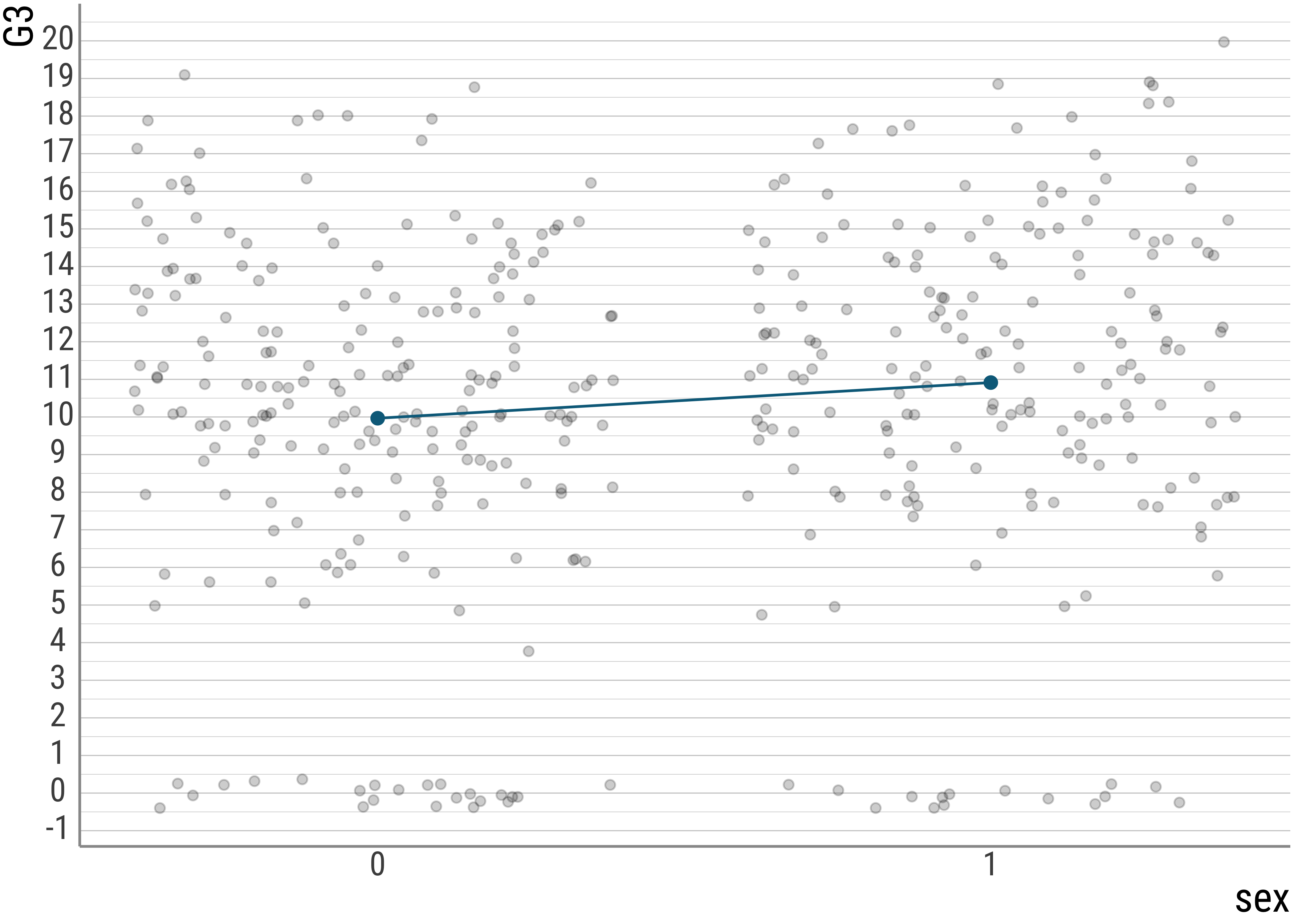
As we can (hopefully) see, the intercept that the model predicts is exactly the mean for the women (coded here 0, more on that later). And if we subtract the condition mean of the men with that of the women, we are left with the predicted slope.
students %>%
  group_by(sex) %>%
  summarise(
    mean = mean(G3)
  )
## # A tibble: 2 × 2
## sex mean
## <chr> <dbl>
## 1 F 9.97
## 2 M 10.9So, essentially what we do when we use the tests we’ve looked at so far is line fitting.
We will walk trough a few other cases to see what’s going on when we increase the complexity.
4.4 Multiple Regression
In multiple regression, we simply add more slopes, while the intercept is now dependent on multiple variables:
\[y = b_0 + b_1x + b_2x + ... + e\] Here is the student data again:
students_mult <- lm(G3 ~ age + sex, data = students)
summary(students_mult)
##
## Call:
## lm(formula = G3 ~ age + sex, data = students)
##
## Residuals:
## Min 1Q Median 3Q Max
## -11.85931 -1.85931 0.28063 3.14069 9.75707
##
## Coefficients:
## Estimate Std. Error t value Pr(>|t|)
## (Intercept) 19.50235 2.99661 6.5081 0.0000000002329 ***
## age -0.56997 0.17813 -3.1997 0.001488 **
## sexM 0.90648 0.45467 1.9937 0.046877 *
## ---
## Signif. codes: 0 '***' 0.001 '**' 0.01 '*' 0.05 '.' 0.1 ' ' 1
##
## Residual standard error: 4.51 on 392 degrees of freedom
## Multiple R-squared: 0.035884, Adjusted R-squared: 0.030965
## F-statistic: 7.295 on 2 and 392 DF, p-value: 0.00077507Let’s plot the data and see what the lines look like. Below I explicitly extract the coefficients from the lm object for illustrative purposes:
equation1 <- function(x) {
  coef(students_mult)[2] * x + coef(students_mult)[1]
}
equation2 <- function(x) {
  coef(students_mult)[2] * x + coef(students_mult)[1] + coef(students_mult)[3]
}

students %>%
  ggplot(aes(
    x = age,
    y = G3,
    color = sex,
    group = sex,
    pch = sex
  )) +
  geom_jitter(alpha = .2) +
  stat_summary(fun = mean, geom = "point", size = 2) +
  stat_function(
    fun = equation1,
    geom = "line", color = colors[1]
  ) +
  stat_function(
    fun = equation2,
    geom = "line", color = colors[2]
  ) +
  xlim(0, 25) +
  scale_y_continuous(breaks = scales::breaks_extended(n = 18)) +
  scale_color_manual(values = colors)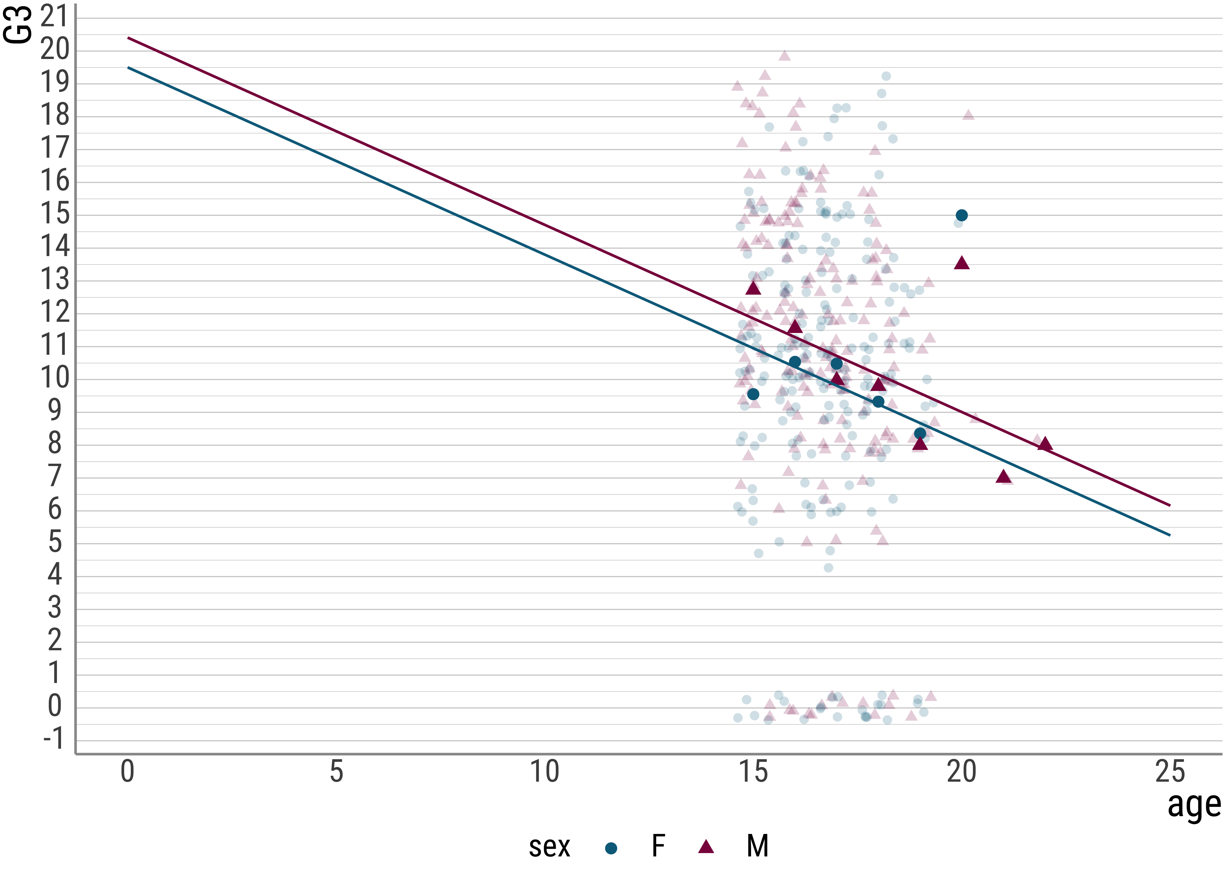
And now let’s add an interaction term:
students_mult_int <- lm(G3 ~ age * sex, data = students)
summary(students_mult_int)
##
## Call:
## lm(formula = G3 ~ age * sex, data = students)
##
## Residuals:
## Min 1Q Median 3Q Max
## -12.40927 -1.70410 0.39417 2.89459 10.09934
##
## Coefficients:
## Estimate Std. Error t value Pr(>|t|)
## (Intercept) 13.15019 4.35878 3.0169 0.00272 **
## age -0.19030 0.25986 -0.7323 0.46441
## sexM 12.78493 5.95646 2.1464 0.03246 *
## age:sexM -0.71142 0.35571 -2.0000 0.04619 *
## ---
## Signif. codes: 0 '***' 0.001 '**' 0.01 '*' 0.05 '.' 0.1 ' ' 1
##
## Residual standard error: 4.4928 on 391 degrees of freedom
## Multiple R-squared: 0.045647, Adjusted R-squared: 0.038325
## F-statistic: 6.2339 on 3 and 391 DF, p-value: 0.00038297students %>%
ggplot(aes(x = age, y = G3, color = sex, pch = sex, group = sex)) +
geom_jitter(alpha = .2) +
stat_summary(fun = mean, geom = "point", size = 2) +
stat_smooth(method = "lm", fullrange = TRUE, se = FALSE) +
scale_y_continuous(breaks = scales::breaks_extended(n = 16)) +
xlim(0, 25) +
scale_color_manual(values = colors)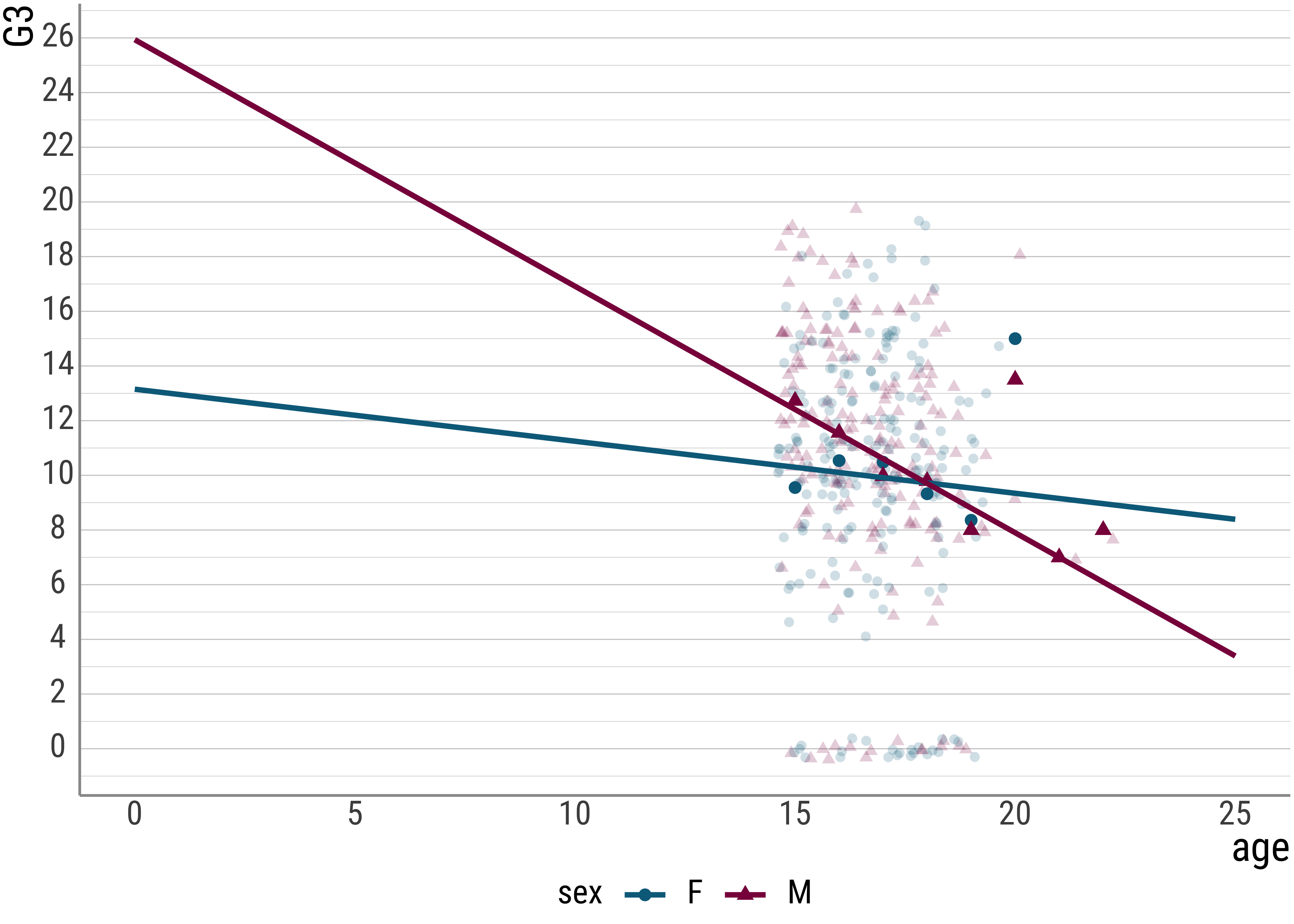
Here is an example equation for a regression with two predictors and an interaction term (without the error):
\[y = b_0 + b_1x_1 + b_2x_2 + b_3(x_1 * x_2)\]
As you see here, the interaction term estimates a multiplicative effect for the two predictors. As with the main effects, if \(b_3\) is close to zero, the interaction is small.
4.5 Centering and Standardization
Here is a small illustration of scaling/transforming, centering, and standardization.
Centering simply involves subtracting the mean from the individual observations. This will give a new meaning to the intercept, which will now represent the overall mean of the dependent variable, rather than its value at predictor = 0.
In formula-talk, we could represent a centered predictor like this:
\[y = b_0 + b_1(x - \bar{x}) + e\] Let’s what happens when we center the age predictor below.
students <- students %>%
  mutate(
    age_bar = mean(age),
    age_c = age - age_bar # alternative: scale(., scale = FALSE)
  )
students %>%
  select(G3, age, age_c, age_bar) %>%
  head()
## G3 age age_c age_bar
## 1 6 18 1.30379747 16.696203
## 2 6 17 0.30379747 16.696203
## 3 10 15 -1.69620253 16.696203
## 4 15 15 -1.69620253 16.696203
## 5 10 16 -0.69620253 16.696203
## 6 15 16 -0.69620253 16.696203students_c <- lm(G3 ~ age_c, data = students)
summary(students_c)##
## Call:
## lm(formula = G3 ~ age_c, data = students)
##
## Residuals:
## Min 1Q Median 3Q Max
## -11.39920 -1.65882 0.34118 3.18092 9.50143
##
## Coefficients:
## Estimate Std. Error t value Pr(>|t|)
## (Intercept) 10.41519 0.22778 45.7253 < 0.00000000000000022 ***
## age_c -0.58013 0.17873 -3.2458 0.001271 **
## ---
## Signif. codes: 0 '***' 0.001 '**' 0.01 '*' 0.05 '.' 0.1 ' ' 1
##
## Residual standard error: 4.527 on 393 degrees of freedom
## Multiple R-squared: 0.026108, Adjusted R-squared: 0.02363
## F-statistic: 10.535 on 1 and 393 DF, p-value: 0.0012714students %>%
mutate(sex = if_else(sex == "F", 0, 1)) %>%
ggplot(aes(x = age_c, y = G3)) +
geom_jitter(alpha = .2) +
stat_summary(fun = mean, geom = "point", size = 2, color = colors[1]) +
stat_smooth(method = "lm", geom = "line", color = colors[1], se = FALSE, fullrange = TRUE) +
scale_y_continuous(breaks = scales::breaks_extended(n = 18))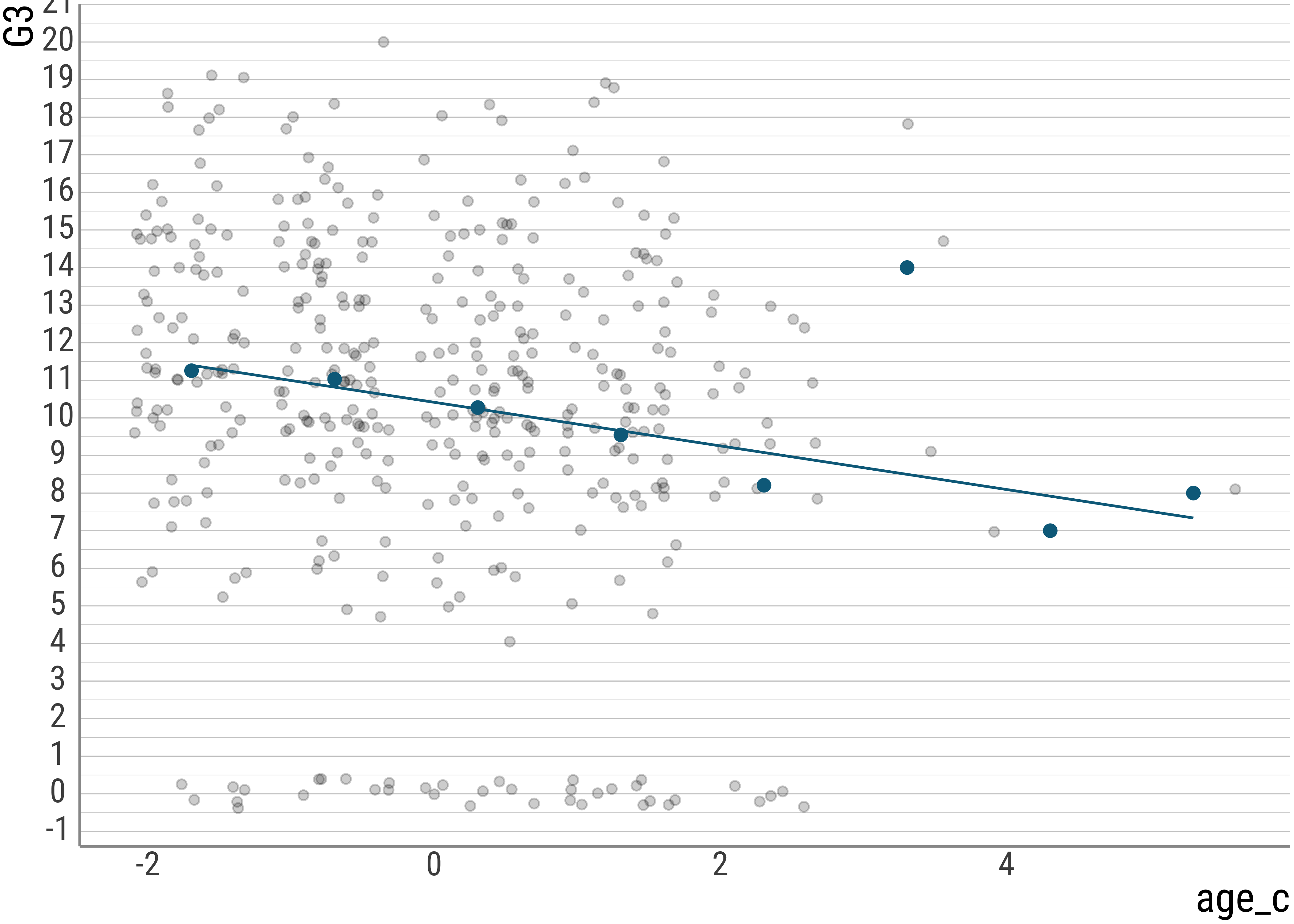
Question: Why does it make sense in this case to center the age predictor? Does it help interpreting the model at all? Why?
We call centering a linear transformation because all values are affected in the same way. Adding 2 to every value would also be linear, for example.
Here’s another linear transformation, the so-called \(z\) transformation. What we do here is to take the centered value and divide it by the standard deviation of the centered variable. This turns all of our values into ones from a distribution with \(\bar{x} \approx 0\) and \(s = 1\).
students <- students %>%
  mutate(
    age_z = age_c / sd(age_c), # alternative: scale(.)
    age_z_bar = mean(age_z),
    age_z_s = sd(age_z)
  )
students %>%
  select(G3, age, age_c, age_bar, age_z, age_z_bar, age_z_s) %>%
  head()
## G3 age age_c age_bar age_z age_z_bar age_z_s
## 1 6 18 1.30379747 16.696203 1.02175064 0.0000000000000012813074 1
## 2 6 17 0.30379747 16.696203 0.23807782 0.0000000000000012813074 1
## 3 10 15 -1.69620253 16.696203 -1.32926782 0.0000000000000012813074 1
## 4 15 15 -1.69620253 16.696203 -1.32926782 0.0000000000000012813074 1
## 5 10 16 -0.69620253 16.696203 -0.54559500 0.0000000000000012813074 1
## 6 15 16 -0.69620253 16.696203 -0.54559500 0.0000000000000012813074 1Question: What could be the upshot of such an operation? Maybe try to think of predictors other than age.
While a log transformation is non-linear because it affects larger values more strongly than it does smaller ones (and thus serves to cure positive skew), centering and standardization are both linear transformations that affect all observations in the same way.
range(diamonds$price)## [1] 326 18823diamonds_scaled <- diamonds %>%
select(carat, price) %>%
mutate(
price_log10 = log10(price),
price_log10_c = price_log10 - mean(price_log10), # or: scale(., scale = F)
price_log10_z = price_log10_c / sd(price_log10_c) # or: scale(.)
)diamonds_scaled %>%
ggplot() +
geom_histogram(aes(x = price), fill = colors[1]) +
diamonds_scaled %>%
ggplot() +
geom_histogram(aes(x = price_log10), fill = colors[1]) +
diamonds_scaled %>%
ggplot() +
geom_histogram(aes(x = price_log10_c), fill = colors[1]) +
diamonds_scaled %>%
ggplot() +
geom_histogram(aes(x = price_log10_z), fill = colors[1])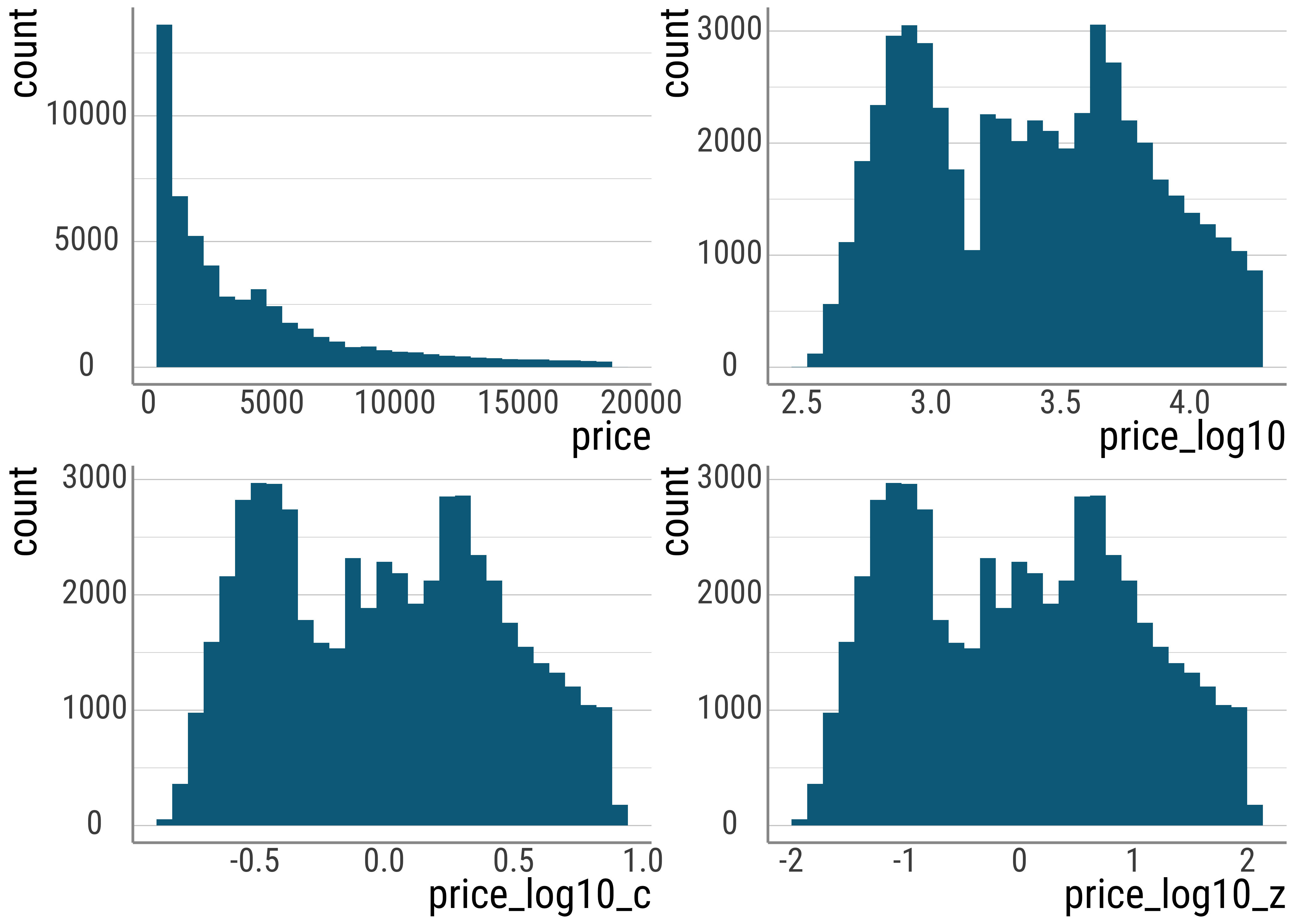
Figure 4.4: Comparison of raw prices with scaled and transformed values.
Note that the output of the Pearson correlation function cor is exactly identical to the slope estimated by a linear regression with one predictor when both \(y\) and \(x\) are z-scores:
diamonds_scaled <- diamonds_scaled %>%
  mutate(
    carat_log10_z = scale(log10(carat))
  )

cor(diamonds_scaled$price_log10_z, diamonds_scaled$carat_log10_z)
## [,1]
## [1,] 0.96591372# -1 removes the intercept computation, we know it's zero because of z-scores
lm(price_log10_z ~ -1 + carat_log10_z, data = diamonds_scaled)##
## Call:
## lm(formula = price_log10_z ~ -1 + carat_log10_z, data = diamonds_scaled)
##
## Coefficients:
## carat_log10_z
## 0.96591In the plots below, we have some interactions:
- Above: main effect possibilities without interactions
- below: including interactions – main effects determined by means, interactions by slopes.
- Ltr/ttb: no main effect, main effect for \(x\) factor, split factor main effect, main effects for both, no main effect but interaction, \(x\) factor effect plus interaction, split factor effect plus interaction, two main effects plus interaction.
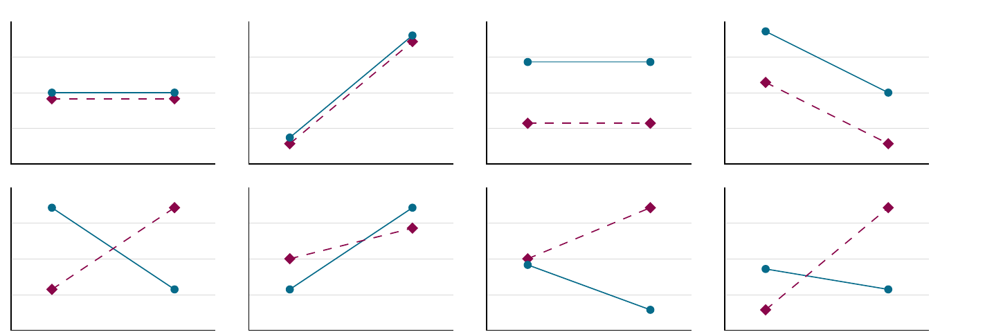
Figure 4.5: Interactions
4.6 Interpreting interactions
Interactions make interpretation hard. Let’s see what there is to do.
Here is the simple pricing model with two predictors. The first is continuous, and gives us as indication about the weight of the diamonds. The second is categorical and gives us color information.
Here, we use treatment contrasts.
diamonds_sub <- diamonds %>%
  select(carat, price, color) %>%
  filter(color %in% c("E", "J"))

# this does not do much here, because R automatically uses treatment coding
# but it helps to be explicit about this
diamonds_sub$color <- droplevels(diamonds_sub$color)
contrasts(diamonds_sub$color) <- contr.treatment(2)

lm(price ~ carat + color, diamonds_sub)
##
## Call:
## lm(formula = price ~ carat + color, data = diamonds_sub)
##
## Coefficients:
## (Intercept) carat color2
## -2042.5 7781.5 -1676.9Let’s clean up the output of the lm() command a bit. The tidy() function from the broom package gives us a dataframe, rather than the onslaught of text we saw above.
This is a little bit nicer to read:
# load the broom package
library(broom)

lm_diam_twopred <- lm(price ~ carat + color, diamonds_sub)
lm_diam_twopred %>%
  tidy() %>%
  select(term, estimate)
## # A tibble: 3 × 2
## term estimate
## <chr> <dbl>
## 1 (Intercept) -2042.
## 2 carat 7782.
## 3 color2 -1677.Let’s compare this to a model with an interaction term (where we replace + with * in the formula of the the lm() function call):
lm_diam_twopredint <- lm(price ~ carat * color, diamonds_sub)

lm_diam_twopredint %>%
  tidy() %>%
  select(term, estimate)
## # A tibble: 4 × 2
## term estimate
## <chr> <dbl>
## 1 (Intercept) -2381.
## 2 carat 8296.
## 3 color2 -540.
## 4 carat:color2 -1202.So, the intercepts and slopes differ. Why is that? First, their meanings changed.
Recall that in the two-predictor case the intercept is to be interpreted as 0 carat and E color. The slope for carat tells us the change in price for one carat. The slope for the treatment (our color J) then tells us that this color achieves a lower price per change in carat.
With the interaction present, these meanings change slightly.
The carat slope is now the slope only for the color E, and not the average effect of weight.
Similarly, the effect of color.L now only tracks the color difference for diamonds with a weight of 0 carat. It is no longer the average effect of the color change.
And now for the new coefficient: the interaction term. This tells us how to adjust the slopes for the color L. Here, because of the negative sign, this means that for the color L the slope is less steep than it is for our reference level.
This is what we call a simple effect: namely the influence of one predictor for only one level of another predictor. This is different from the main effects we got before.
Note also that for the case with two predictors with two levels each (and an interaction), each of the two predictors will be associated with two simple effects, namely one for each value of the other predictor. And the interaction represents the difference between these simple effects. If the interaction term is zero, the two simple effects are equal (and equal to the main effect).
The mental calculation we have to do is this: The carat slope for the other color is \(8296\). To get the slope for color L, we need to add the interaction term: \(8296 + (- 1202) = 7094\). That is, this color is less affected by an increase in weight, and thus achieves a lower price overall.
We can see this in the plots below as well (note that the individual data points do not change, only the representation of the data in the form of a line does; our model is different):
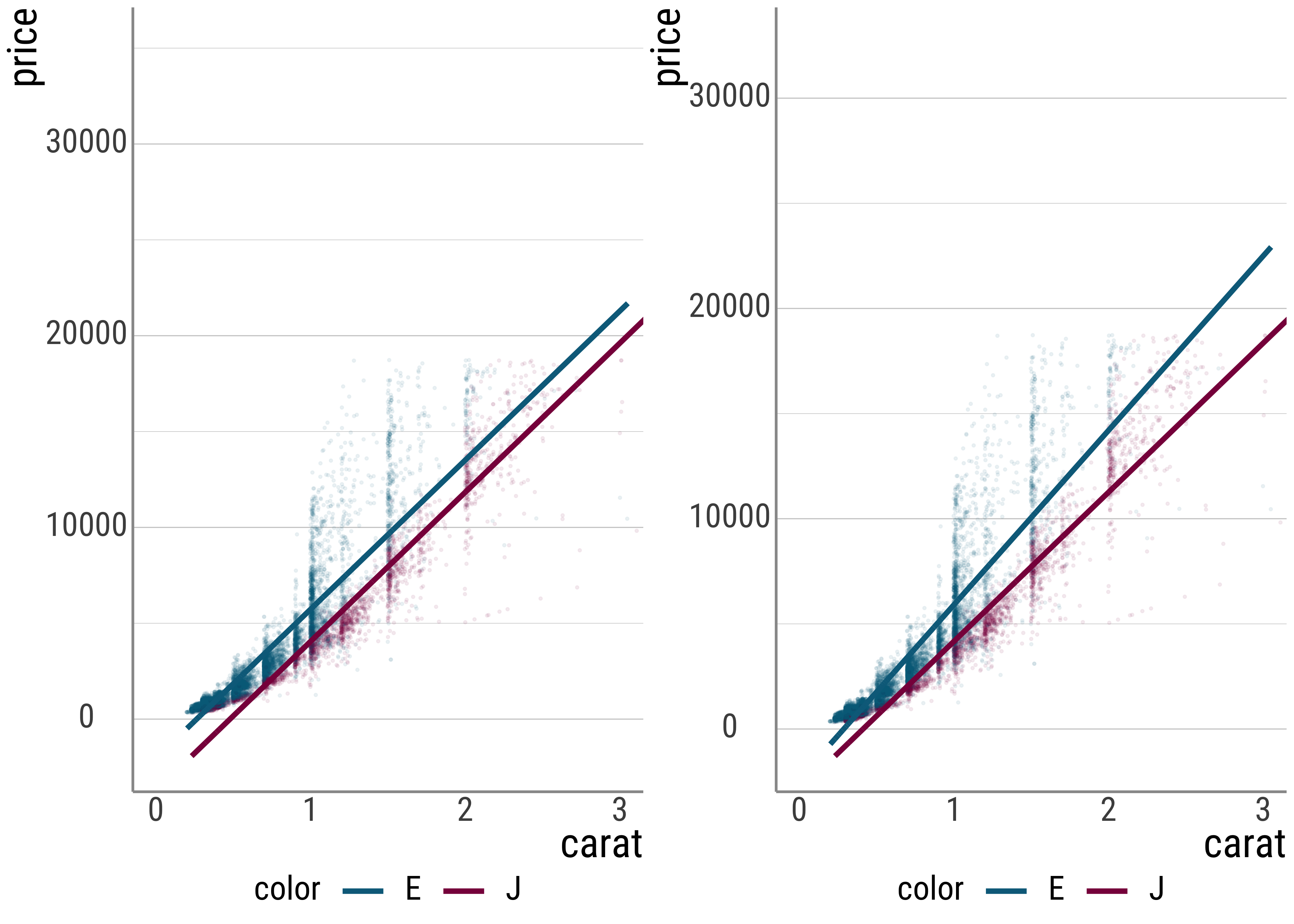
(#fig:p_twopredint)Comparison between (i) no interaction term and (ii) yes interaction term.
Note that we can also add a further technique to make the output of the interaction term a little bit easier: We can center the carat predictor.
Recall that this changes the meaning of the intercept to the mean.
This then means that we have a changed interpretation of the color manipulation as well: It represents the difference between the two for the average value of carat in our dataset.
Arguably, this is easier to understand than thinking about diamonds with a weight of zero (the interpretation in our uncentered model).
Let’s look at this:
lm_diam_twopredint_c <- diamonds_sub %>%
  mutate(carat_c = carat - mean(carat)) %>%
  lm(price ~ carat_c * color, .)

lm_diam_twopredint_c %>%
  tidy() %>%
  select(term, estimate)
## # A tibble: 4 × 2
## term estimate
## <chr> <dbl>
## 1 (Intercept) 4009.
## 2 carat_c 8296.
## 3 color2 -1465.
## 4 carat_c:color2 -1202.Another way of going about this is to change the contast coding from treatment conding to sum coding. If we switch to sum coding, each coefficient for the sum-coded predictors represents the half of the difference between the two predictor levels. In other words, what we now have are main effects, rather than simple effects.
You can think of sum-coding for categorical variables as the analogue of centering (or standardizing, which subsumes centering) for continuous predictors.
diamonds_sub$color <- droplevels(diamonds_sub$color)
contrasts(diamonds_sub$color) <- contr.sum(2)
diamonds_sub %>%
  mutate(carat_c = carat - mean(carat)) %>%
  lm(price ~ carat_c * color, data = .) %>%
  tidy() %>%
  select(term, estimate)
## # A tibble: 4 × 2
## term estimate
## <chr> <dbl>
## 1 (Intercept) 3276.
## 2 carat_c 7695.
## 3 color1 733.
## 4 carat_c:color1 601.Exercise: So far, we looked at the mixed cases, where one predictor is categorical and one is continuous. As an exercise, please compute (at least) two further linear models, each with two predictors of the same data type. In the case with two continuous predictors, you should think about centering or standardizing the predictors and try to think about the changes this choice induces. There’s no need to do an interaction analysis.
For the case with two categorical predictors, please include an interaction term in the model formula. You should also make a decision about what contrast coding scheme you want to follow.
For both, you should write a short description of the model you ran as well an interpretation of the modal coefficients.