Gifs in R
Cheat Sheet zu gganimate (und anderen Paketen) hier erhältlich: https://www.rstudio.com/resources/cheatsheets/
Normalverteilung
# alternative theme
library(hrbrthemes)
theme_maik <- function() {
  theme_ipsum_rc() %+replace%
    theme(
      panel.grid.major.x = element_blank(),
      panel.grid.minor.x = element_blank()
    )
}
# dispersion of normal distribution
cols <- scico(5, palette = "devon", end = .5)
ggplot(data = data.frame(x = c(-7, 7)), aes(x)) +
geom_curve(aes(x = 5.5, xend = 5.5, y = .4, yend = 0.05),
arrow = arrow(length = unit(0.08, "inch")), size = 0.5,
color = cols[1], curvature = 0) +
annotate("text", x = 5.8, y = .3,
size = 3.2, color = cols[1], angle = 270,
label = "Higher Standard Deviation") +
stat_function(fun = dnorm, n = 101, args = list(mean = 0, sd = 1),
color = cols[1], size = 1) +
stat_function(fun = dnorm, n = 101, args = list(mean = 0, sd = 1.5),
color = cols[2], size = 1) +
stat_function(fun = dnorm, n = 101, args = list(mean = 0, sd = 2),
color = cols[3], size = 1) +
stat_function(fun = dnorm, n = 101, args = list(mean = 0, sd = 2.5),
color = cols[4], size = 1) +
stat_function(fun = dnorm, n = 101, args = list(mean = 0, sd = 3),
color = cols[5], size = 1) +
scale_y_continuous(breaks = NULL) +
theme_maik() +
labs(x = "", y = "") +
transition_layers(from_blank = F) +
enter_grow()
# location of normal distribution
cols <- scico(5, palette = "devon", end = .5)
ggplot(data = data.frame(x = c(-4, 16)), aes(x)) +
  geom_curve(aes(x = 0, xend = 12, y = .43, yend = .43),
    arrow = arrow(length = unit(0.08, "inch")), size = 0.5,
    color = cols[1], curvature = 0) +
  annotate("text", x = 6, y = .45,
    size = 3.2, color = cols[1], label = "Higher Mean") +
  stat_function(fun = dnorm, n = 101, args = list(mean = 0, sd = 1),
    color = cols[1], size = 1) +
  stat_function(fun = dnorm, n = 101, args = list(mean = 3, sd = 1),
    color = cols[2], size = 1) +
  stat_function(fun = dnorm, n = 101, args = list(mean = 6, sd = 1),
    color = cols[3], size = 1) +
  stat_function(fun = dnorm, n = 101, args = list(mean = 9, sd = 1),
    color = cols[4], size = 1) +
  stat_function(fun = dnorm, n = 101, args = list(mean = 12, sd = 1),
    color = cols[5], size = 1) +
  scale_y_continuous(breaks = NULL) +
  theme_maik() +
  labs(x = "", y = "") +
  transition_layers(from_blank = F, keep_layers = c(Inf, Inf, 0, 0, 0, 0, 0)) +
  exit_drift(x_mod = 3, y_mod = 0)
P-Wert-Verteilung
# DOES NOT WORK AT THE MOMENT

# static plots from: https://gist.github.com/dgrtwo/1337b9d5c80adde1bc7a72048d9e4cc6
library(broom)

# generate data
t_tests <- crossing(pi0 = .75,
  effect_size = .25,
  trial = 1:10000,
  sample_size = c(10, 30, 100, 300)) %>%
  mutate(h1 = runif(n()) > pi0) %>%
  unnest(map(sample_size, seq_len)) %>% # something is wrong with map
  mutate(x = rnorm(n(), h1 * effect_size, 1)) %>%
  group_by(pi0, effect_size, sample_size, trial, h1) %>%
  summarize(test = list(t.test(x))) %>%
  unnest(map(test, tidy)) %>%
  ungroup()

head(t_tests)
# SEE COMMENT ABOVE
# plot animation
t_tests %>%
ggplot(aes(p.value, fill = ifelse(h1, "alternative", "null"))) +
geom_histogram(binwidth = .05, boundary = 0) +
labs(fill = "H1",
x = "P-value",
title = "P-value Distribution with Sample Size = {closest_state}",
subtitle = "One-sample t-test, pi0 = .75, alternative mean = .25, m = 10000") +
theme_maik() +
transition_states(sample_size)Korrelation
from: https://crumplab.github.io/statistics/gifs.html
Correlation between random deviates from normal distribution across four sample sizes
# data
all_df <- data.frame()
for (sim in 1:10) {
  for (n in c(10, 50, 100, 1000)) {
    North_pole <- rnorm(n, 0, 1)
    South_pole <- rnorm(n, 0, 1)
    t_df <- data.frame(nsize = rep(n, n),
      simulation = rep(sim, n),
      North_pole,
      South_pole)
    all_df <- rbind(all_df, t_df)
  }
}
head(all_df)
## nsize simulation North_pole South_pole
## 1 10 1 -1.4879262 1.1612893
## 2 10 1 -1.1619376 0.3983627
## 3 10 1 -1.5890897 0.3623522
## 4 10 1 0.4195830 -0.8525257
## 5 10 1 -0.9929283 1.9536679
## 6 10 1 -2.1645471 -0.1642708Beachte die hohe Variabilität des Korrelationskoeffizienten bei kleinen Stichproben über die 10 Simulationen:
cor_by <- by(all_df, list(all_df$simulation, all_df$nsize),
  function(x) cor(x$North_pole, x$South_pole))
rbind(cor_by)
## 10 50 100 1000
## 1 -0.5918917 -0.092977251 0.03787743 0.039855996
## 2 0.1667258 -0.077223258 -0.07990132 0.027070831
## 3 -0.1707260 -0.045979624 0.07474168 0.033863227
## 4 -0.1684336 -0.088069191 0.09824673 0.034628231
## 5 -0.1105484 0.114470224 -0.17458249 0.004448221
## 6 -0.4793814 0.301845167 -0.21520614 0.014994305
## 7 0.2114297 0.007627771 0.08877511 -0.013933219
## 8 -0.1645379 -0.234096228 0.22155066 0.017613001
## 9 -0.2087030 -0.082574886 0.16194774 0.022472051
## 10 0.3066167 0.118468209 0.09536719 0.016152547# generate the animation
ggplot(all_df, aes(x = North_pole, y = South_pole)) +
geom_point() +
geom_smooth(method = lm, se = FALSE) +
theme_maik() +
facet_wrap(~nsize) +
transition_states(
simulation,
transition_length = 2,
state_length = 1
) + enter_fade() +
exit_shrink() +
ease_aes('sine-in-out')## `geom_smooth()` using formula 'y ~ x'
Correlation between X and Y variables that have a true correlation
library(MASS)

proportional_permute <- function(x, prop) {
  indices <- seq(1:length(x))
  s_indices <- sample(indices)
  n_shuffle <- round(length(x) * prop)
  switch <- sample(indices)
  x[s_indices[1:n_shuffle]] <- x[switch[1:n_shuffle]]
  return(x)
}

# data
all_df <- data.frame()
for (sim in 1:10) {
  for (samples in c(10, 50, 100, 1000)) {
    North_pole <- runif(samples, 1, 10)
    South_pole <- proportional_permute(North_pole, .5) + runif(samples, -5, 5)

    t_df <- data.frame(nsize = rep(samples, samples),
      simulation = rep(sim, samples),
      North_pole,
      South_pole)
    all_df <- rbind(all_df, t_df)
  }
}
head(all_df)
## nsize simulation North_pole South_pole
## 1 10 1 2.703927 9.96016940
## 2 10 1 2.291694 -1.49980938
## 3 10 1 6.972790 -0.09346151
## 4 10 1 8.806318 10.56235905
## 5 10 1 6.753495 8.58355443
## 6 10 1 1.755240 -2.75460252Beachte die hohe Variabilität des Korrelationskoeffizienten bei kleinen Stichproben über die 10 Simulationen:
cor_by <- by(all_df, list(all_df$simulation, all_df$nsize),
  function(x) cor(x$North_pole, x$South_pole))
rbind(cor_by)
## 10 50 100 1000
## 1 0.46341286 0.2327006 0.2163476 0.3087383
## 2 0.66209758 0.1981913 0.3887388 0.3047594
## 3 0.08603569 0.2222401 0.1873166 0.3573672
## 4 0.13663875 0.4500101 0.3493339 0.3366337
## 5 -0.05130151 0.3778502 0.3159541 0.3538828
## 6 0.04094742 0.3176962 0.2435782 0.3413892
## 7 -0.35403247 0.2123489 0.1713233 0.3478543
## 8 0.51061515 0.4002461 0.3474626 0.3041247
## 9 0.52129439 0.3047629 0.2825007 0.3906099
## 10 0.54610635 0.3258739 0.2551699 0.3190099library(MASS)
proportional_permute <- function(x, prop) {
indices <- seq(1:length(x))
s_indices <- sample(indices)
n_shuffle <- round(length(x) * prop)
switch <- sample(indices)
x[s_indices[1:n_shuffle]] <- x[switch[1:n_shuffle]]
return(x)
}
# data
all_df <- data.frame()
for (sim in 1:10) {
for (samples in c(10, 50, 100, 1000)) {
North_pole <- runif(samples, 1, 10)
South_pole <- proportional_permute(North_pole, .05) + runif(samples, -5, 5)
t_df <- data.frame(nsize = rep(samples, samples),
simulation = rep(sim, samples),
North_pole,
South_pole)
all_df <- rbind(all_df, t_df)
}
}
ggplot(all_df, aes(x = North_pole, y = South_pole)) +
geom_point() +
geom_smooth(method = lm, se = FALSE) +
theme_maik() +
facet_wrap(~nsize) +
transition_states(
simulation,
transition_length = 2,
state_length = 1) +
enter_fade() +
exit_shrink() +
ease_aes('sine-in-out')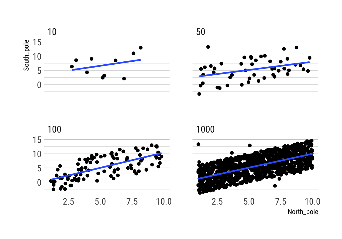
Würfel
Daten
# from: https://gist.github.com/dgrtwo/d590078aae86e24418a7cf5a9fb31ae3
# generate data
# 1. numbers from 1 to 2000
# 2. generate just as many dice roll results
# 3. define the frames for the animation and the amount of aggregation (data will explode)
# 4. exclude rows such that only the dice rolls within the aggregated number stay
# 5. count up the dice rolls for each of those intervalls
simulation <- tibble(roll = 1:2000) %>%
  mutate(result = sample(6, n(), replace = TRUE)) %>%
  crossing(nrolls = seq(10, 2000, 5)) %>%
  filter(roll <= nrolls) %>%
  count(nrolls, result)

# general overview
head(simulation)
## # A tibble: 6 x 3
## nrolls result n
## <dbl> <int> <int>
## 1 10 1 1
## 2 10 2 1
## 3 10 3 2
## 4 10 4 2
## 5 10 5 3
## 6 10 6 1Plots
# plot it with gganimate
p1 <- ggplot(simulation, aes(x = result, y = n, fill = factor(result))) +
  geom_col(position = "identity") +
  transition_manual(nrolls) +
  view_follow() +
  scale_x_continuous(breaks = 1:6) +
  scale_fill_manual(values = viridis::viridis(6)) +
  guides(fill = F) +
  labs(y = "# of rolls with this result",
    title = "Distribution of Results of a Six-Sided Die\nAfter { current_frame } Rolls:") +
  theme_maik()

# animate it
animate(p1)
# again, but with different view options
p2 <- ggplot(simulation, aes(x = result, y = n, fill = factor(result))) +
  geom_col(position = "identity") +
  transition_manual(nrolls) +
  view_static() +
  scale_x_continuous(breaks = 1:6) +
  scale_fill_manual(values = viridis::viridis(6)) +
  guides(fill = F) +
  labs(y = "# of rolls with this result",
    title = "Distribution of results after { current_frame } rolls \nof a six-sided die") +
  theme_maik()

# animate it
animate(p2)
Zeitverlauf
# from: https://github.com/thomasp85/gganimate/wiki/Temperature-time-series
airq <- airquality
airq$Month <- format(ISOdate(2004, 1:12, 1), "%B")[airq$Month]
head(airq)
## Ozone Solar.R Wind Temp Month Day
## 1 41 190 7.4 67 May 1
## 2 36 118 8.0 72 May 2
## 3 12 149 12.6 74 May 3
## 4 18 313 11.5 62 May 4
## 5 NA NA 14.3 56 May 5
## 6 28 NA 14.9 66 May 6ggplot(airq, aes(Day, Temp, group = Month)) +
geom_line() +
geom_segment(aes(xend = 31, yend = Temp), linetype = 2, colour = 'grey') +
geom_point(size = 2) +
geom_text(aes(x = 31.1, label = Month), hjust = 0) +
transition_reveal(Day) +
coord_cartesian(clip = 'off') +
labs(title = 'Temperature in New York', y = 'Temperature (°F)') +
theme_maik() +
theme(plot.margin = margin(5.5, 40, 5.5, 5.5))
Central Limit Theorem
Daten
# sample from non-normal distribution
set.seed(1990)
means <- rep(NA, 1000)
for (i in c(1:1000)) {
  samp100 <- rexp(100)
  means[i] <- round(mean(samp100), digits = 2)
}

# generate data
tibble(sample = 1:1000,
  result = means) %>%
  crossing(nsample = seq(5, 1000, 5)) %>%
  filter(sample <= nsample) %>%
  count(nsample, result) -> d

head(d)
## # A tibble: 6 x 3
## nsample result n
## <dbl> <dbl> <int>
## 1 5 0.94 1
## 2 5 1.01 1
## 3 5 1.02 1
## 4 5 1.14 1
## 5 5 1.16 1
## 6 10 0.86 1Plots
# plot the exponential distribution
# non-normal distribution
population <- rexp(1000)
nnormaldraw <- ggplot() +
  aes(population) +
  geom_histogram(binwidth = .4, fill = viridis::cividis(1)) +
  labs(title = "Exponential Distribution") +
  theme_maik()

nnormaldraw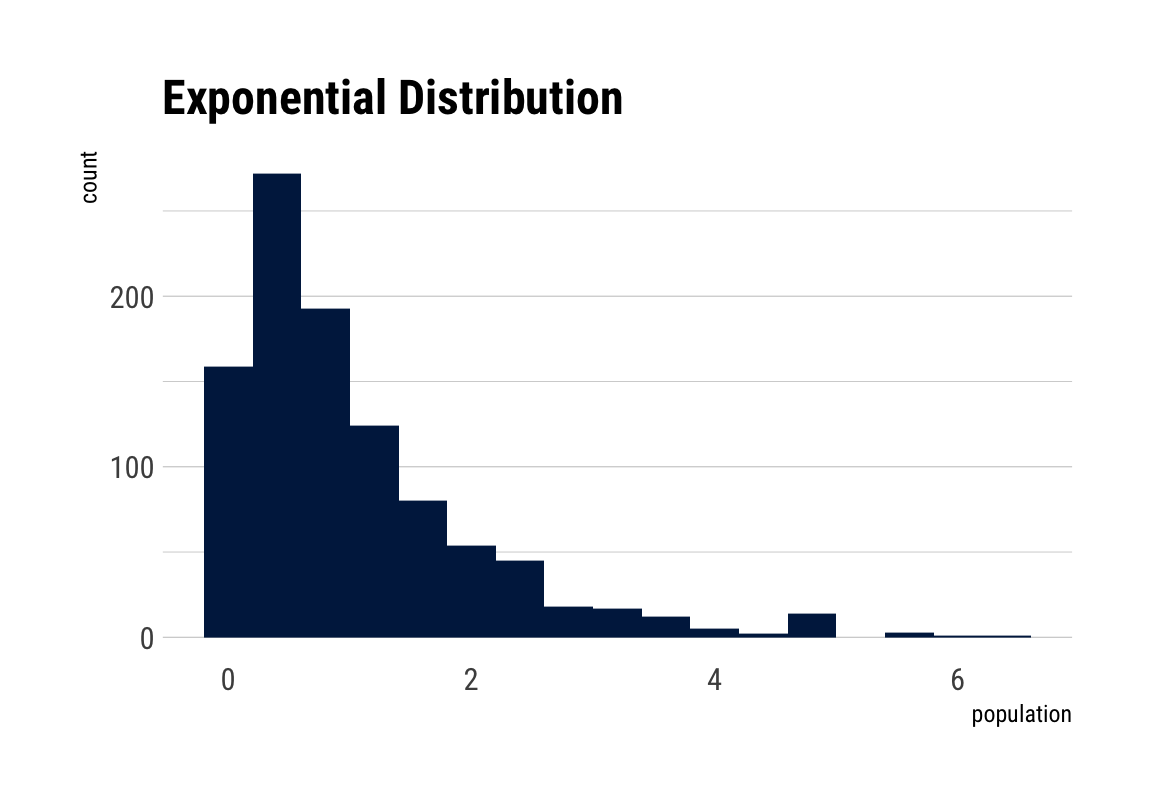
# plot the sampling gif
ggplot(d, aes(x = result, y = n, fill = factor(result))) +
  geom_col(position = "identity") +
  transition_manual(nsample) +
  view_step(pause_length = 2, step_length = 1, nsteps = 5, wrap = F) +
  scale_fill_viridis_d() +
  guides(fill = F) +
  labs(y = "# of samples with this result",
    title = "Distribution of mean results after { current_frame } samples\nfrom Exponential Distribution") +
  theme_maik()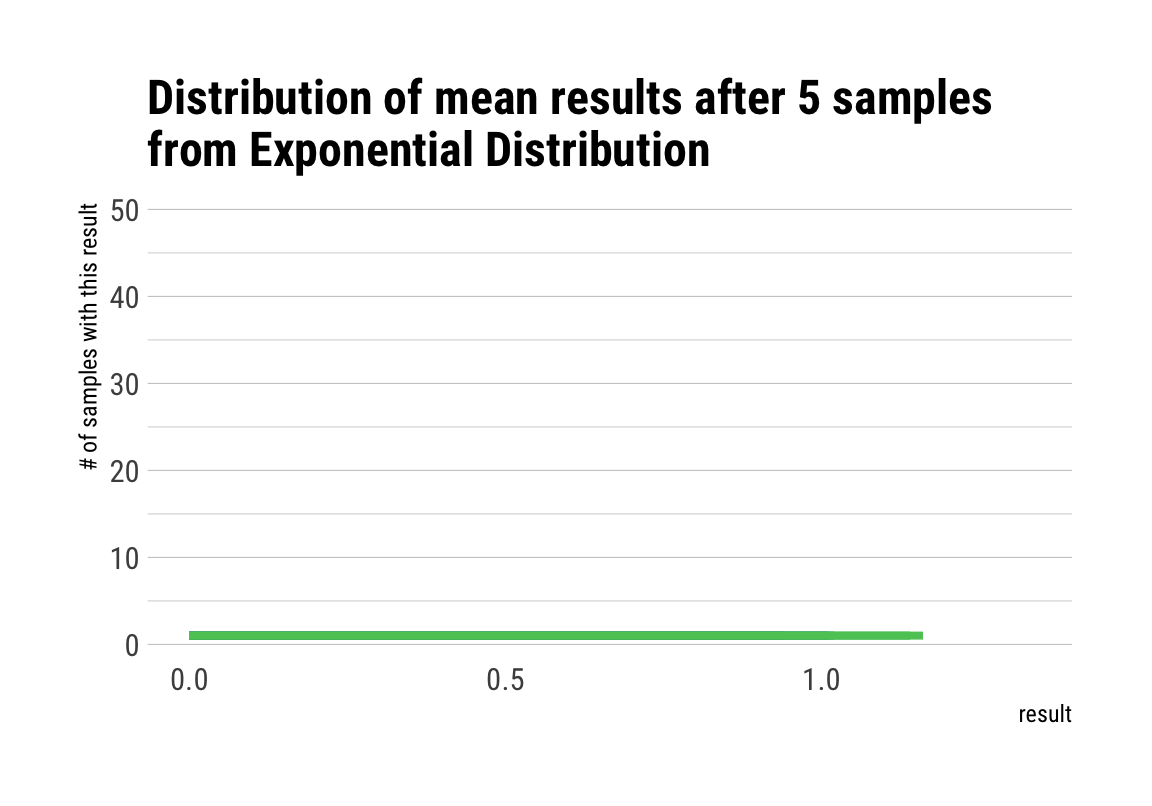
Interaktive Plots
economics
## # A tibble: 6 x 6
##   date         pce    pop psavert uempmed unemploy
##   <date>     <dbl>  <dbl>   <dbl>   <dbl>    <dbl>
## 1 1967-07-01  507. 198712    12.6     4.5     2944
## 2 1967-08-01  510. 198911    12.6     4.7     2945
## 3 1967-09-01  516. 199113    11.9     4.6     2958
## 4 1967-10-01  512. 199311    12.9     4.9     3143
## 5 1967-11-01  517. 199498    12.8     4.7     3066
## 6 1967-12-01  525. 199657    11.8     4.8     3018
# create static ggplot2
p <- ggplot(economics, aes(date, psavert, size = psavert, alpha = 1 / psavert)) +
geom_jitter() +
geom_smooth(method = "lm") +
guides(size = F, alpha = F) +
theme_maik()
p## `geom_smooth()` using formula 'y ~ x'
## `geom_smooth()` using formula 'y ~ x'diamonds
# keep sampled data the same
set.seed(100)
# sample data
d <- diamonds[sample(nrow(diamonds), 1000), ]
head(d)
## carat cut color clarity depth table price x y z
## 16887 1.26 Ideal G SI1 59.6 57 6738 7.08 7.04 4.21
## 3696 0.70 Ideal D VS2 62.7 57 3448 5.65 5.67 3.55
## 31705 0.36 Ideal F SI1 62.0 56 770 4.59 4.54 2.83
## 24270 2.10 Premium J SI2 59.1 58 12494 8.46 8.40 4.98
## 11159 1.21 Premium D SI2 59.7 58 4946 7.06 6.96 4.19
## 26116 2.00 Good E SI2 64.7 57 15393 7.75 7.86 5.05